On-screen graphics are designs/drawings/illustrations/graphs used on screen.
There are many opportunities and limitations of on screen graphic representation.
Graphics are used for a number of things:
- Adverts
- Idents
- Title Sequences
- Info-graphics (information based graphics)
- Olympic games/formula 1 - and other major sporting events
- Title menus (used on DVDs etc)
 |
| On-screen graphic of F1 car |
Simple graphics were first created in the 1950s by MIT (Massachusetts Institute Of Technology). Computer graphics became more popular in the 1980s.
The first TV ident for Channel 4 was designed by Lambie-Nairn. http://www.lambie-nairn.com/
Before the 80s, Television idents did not exist. There was no need for them as there were not many television channels to choose from. The first time on screen graphics were needed on a wide scale was for the General Election in 1992. These graphics were used to represent seats and voting. Nowadays, there is more need for television idents to distinguish between hundreds of channels.
These graphics would have taken up to two years to produce. They were created using Quantel Paintbox. The graphic designers would have to be artists and physically draw out each frame. E.g A 10 second sequence would need 250 images (25 frames a second). The hand draw images would then need to be filmed in a sequence. Due to software advances, this process is a lot quicker now for modern graphic designers.
 |
| Quantel Paintbox |
The limitations of these older graphics were:
- Bad quality
- Time consuming (hand drawing/filming each frame)
- Expensive (pay employees for longer working hours/expensive equipment)
Despite the limitations at the time these new graphics were quite impressive.
Despite dramatic changes in Graphics technology, there are still some limitations:
- Graphics are still time consuming, taking weeks to produce.
- On-screen graphic production is still expensive, computers/machines and softwares are very costly.
- Another limitation is that colour palettes/trends are frequently changing.
- Fonts used for on-screen graphics can not be made bigger (if used on bigger screens) as they will begin to pixelate.
- Suitable typography would need to be used so that information can be read easily but a varied audience.
 |
| RGB/CMYK differences |
- There are still issues with certain colours used on screen. E.g vibrant reds do not transfer from computer to television screens well and are prone to noise and distortion. The RGB (Red, Green, Blue) colour model is additive, so to change a colour you must 'add' a colour. The RGB colour model is usually used on-screen. The CMYK colour model is subtractive, so colours are extracted to make new colours. CMYK (Cyan, Magenta, Yellow and Key/Black) is mainly used in printing. Software such as Adobe have their own versions of these colour models.
 |
RGB AND CMYK colour models
|
- Television screens have an aspect ratio of 4:3, and are rectangles, whereas some computer screens used to create the graphics are square. This is inhibiting for a graphics designer because all graphics must be in the rectangle/landscape format. (Modern flat-screens are 16:9)
 |
| Aspect ratio |
- There are also problems with resolution. Computer screens may have a high resolution than some of the publics TVs. This would cause the graphics to look worse quality on TV.
- Sections of society have older technology and so graphics will not be appreciated on older TVs.
- It seems software and computer's technology is moving too fast for TV technology.
- Another issue is moiré fringing. Moiré fringing is an interference on screen which occurs when two grids/sets of fine horizontal lines are laid over each other at a slight angle and they move. This problem usually occurs with interlaced video production. The interference occurs if you film something with lines. e.g. some television shows advice members of the audience against wearing fine striped clothing/houndstooth patterns. Video showing moiré pattern: http://www.youtube.com/watch?v=msWLCMxnoBo&feature=relmfu
 |
| Example of moiré interference in photography |
The opportunities of on screen graphic representation are:
- As more TV channels were introduced, these channels would need to have branding to be recognised. So idents became more popular. The more channels there are the bigger the audiences which brings in more money for a company.
- Different idents could be produced for these new channels which cater for different audiences, such as Channel 4 for teenagers.
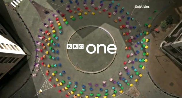
- On-screen graphics could encourage brand loyalty, which is built over a number of years if the graphics remain the same. If a companies mission statement and values remain the same they will maintain an audience. This loyalty could be built through familiar TV idents. An example of this is the BBC 1 ident. The globe/world/circle shaped motif's in the centre of the ident can be recognised worldwide, however the circle shape is more subtle in some of the idents. It represents that the company is well established, non biased, trusted and an international brand. Also, the BBC's mission statement has remained the same for many years: 'Inform, Educate, Entertain'.
 |
| BBC ONE 'Globe' ident |
- Another opportunity is the creation of tone through on-screen graphics. The tone of an ident or graphic can be established by colours, music and the tempo. The tone of the ident contributes to the branding and target audience of a company eg. young, old, formal, informal.
- Branded content gives clothing/technology and other establishments the chance to advertise products subtly through on-screen graphics. eg. a group of people wearing a particular brand of shoes (Converse).
- On screen graphics can also communicate numerical, statistical and text-based information to an audience, which is useful for services such as the News. They also make potentially boring information appear more exciting and interesting. Finally, they could make complicated subjects easier to comprehend.
 |
| Communicating information on a News channel |


No comments:
Post a Comment